VOLUNTEERO
OVERVIEW
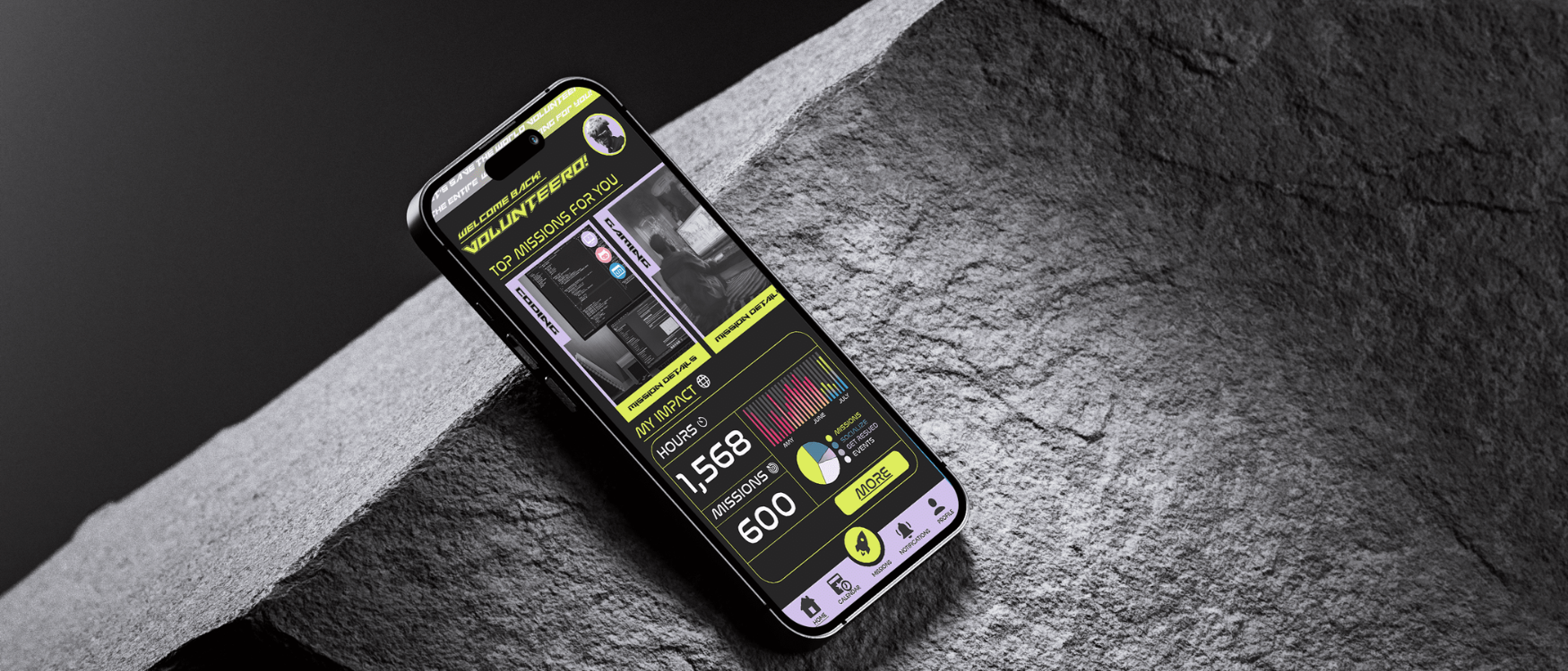
Volunteero is a B2C app designed to promote volunteering work through a gamified interface.
I crafted and led the end-to-end mobile user experience and interaction design from user flows, rapid testing, and prototyping to producing engaging animations and motion design.
In collaboration with a full-stack developer, Volunteero is currently in the early stages of software development.
Role
UX/UI Lead
Visual Design, Interaction Design, Rapid Testing, Prototyping, User Flows, and Research.
Timeline
6 Months +
Gamifying the volunteering experience
CONTEXT
An opportunity to create an engaging virtual community fueled by altruism.
The longing for human connection, coupled with the innate desire to make a difference, remains unaddressed.The prevailing isolation leaves individuals yearning for a space where they can not only offer assistance but also forge genuine connections with others who share the same altruistic spirit.
It’s about creating a circle of compassion and empathy
PROBLEM
"I can't change the world, I'm only one person"
Amid the hustle and bustle of modern life, the constraints of time and the demands of work create insurmountable barriers for those eager to volunteer and make a difference. The traditional route of seeking out non-profit organizations becomes a luxury, a time-consuming endeavour that many cannot afford. As a result, people find themselves trapped in a cycle of isolation, yearning to contribute but lacking the means to do so.
A prevailing sense of hopelessness pervades as individuals grapple with the belief that their solitary efforts cannot effect change on a global scale.
According to a study conducted by CIGNA, 42% of people aged 18-34 report always feeling left out and lonely.
With a busy life and a job, most people find it difficult to have the time to volunteer and help others in need.
THE CHALLENGE
To address the problems we had to start with the ‘how’
How do we design a platform that excites people to do more volunteering work without feeling like it's a chore?
How would we get people the help that they need in a quick manner?
How do we appeal to the 18-37 demographic?
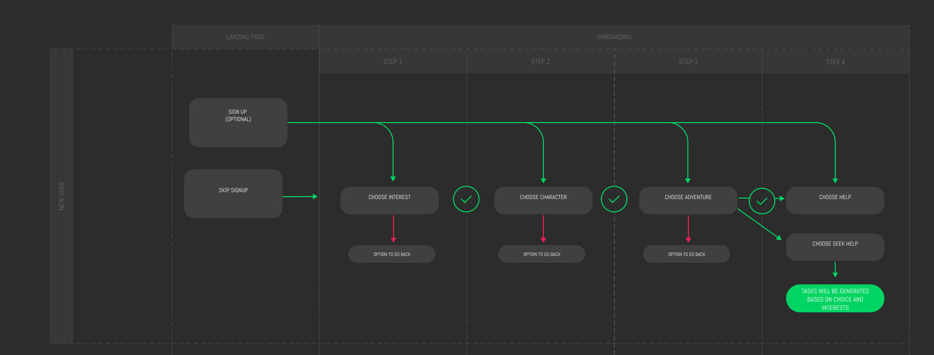
User Flows
SIGN UP (OPTIONAL)
AUTHENTICATE PROFILE
CHOOSE INTEREST
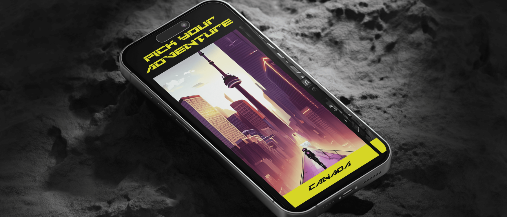
CHOOSE ADVENTURE
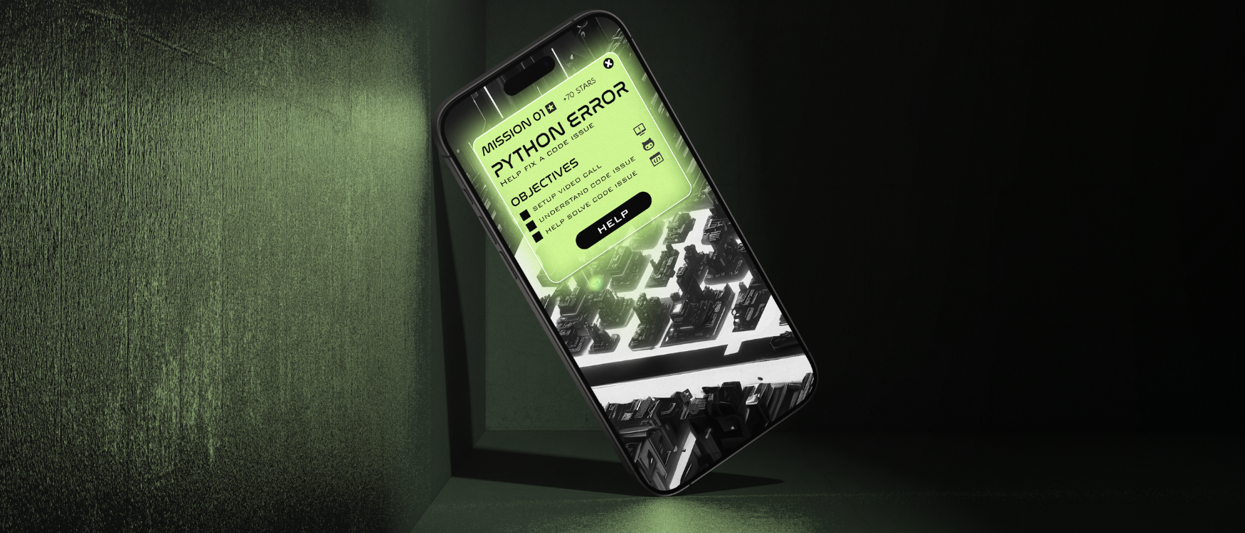
HELP OR GET HELPED
DESIGNING THE INTERFACE
STUDYING THE USER BEHAVIOR“WHICH ONES CAN I PRESS ON?”
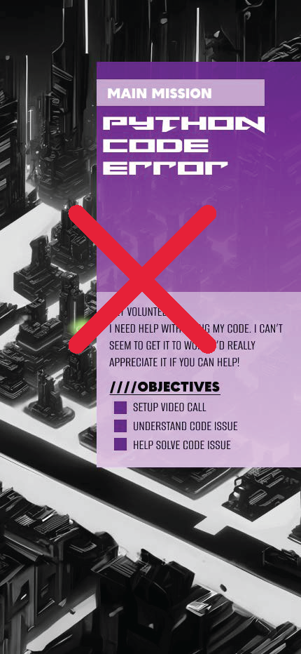
After conducting various A/B testing and interviews with users, it was evident that users were getting confused and overwhelmed with the amount of information and graphics presented when picking an adventure.
It was difficult for the users to tell which adventures were locked and which ones they can choose.
The revised and simplified interface increased their engagement by approximately 50%. Users found the new interface engaging and easy to use.
UNDERSTANDING THE CONFUSION“NOW IT MAKES SENSE”
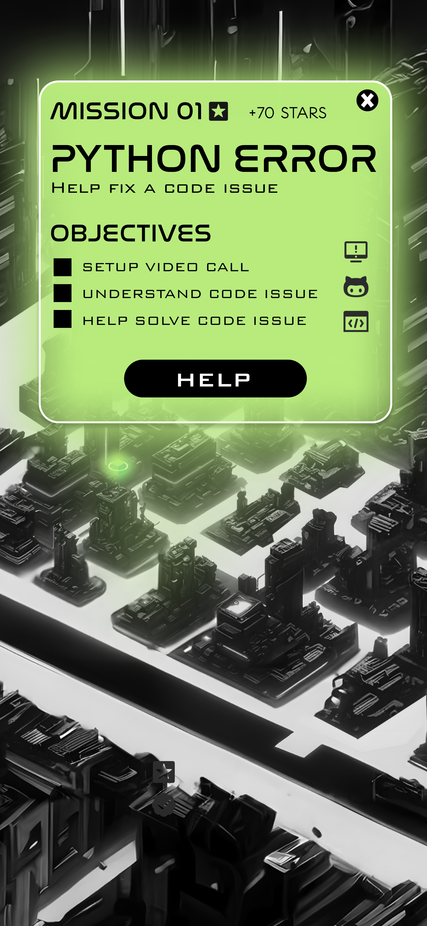
Through the A/B testing process, we noticed that the users were more engaged with the simpler interface with a clear call to action.
During the interview process with users aging between 20 and 32, users told us that the simpler interface made it easy to understand what is being asked of them. This simple change in the interface increased their engagement with the ‘missions’ section of the app by almost 63%.
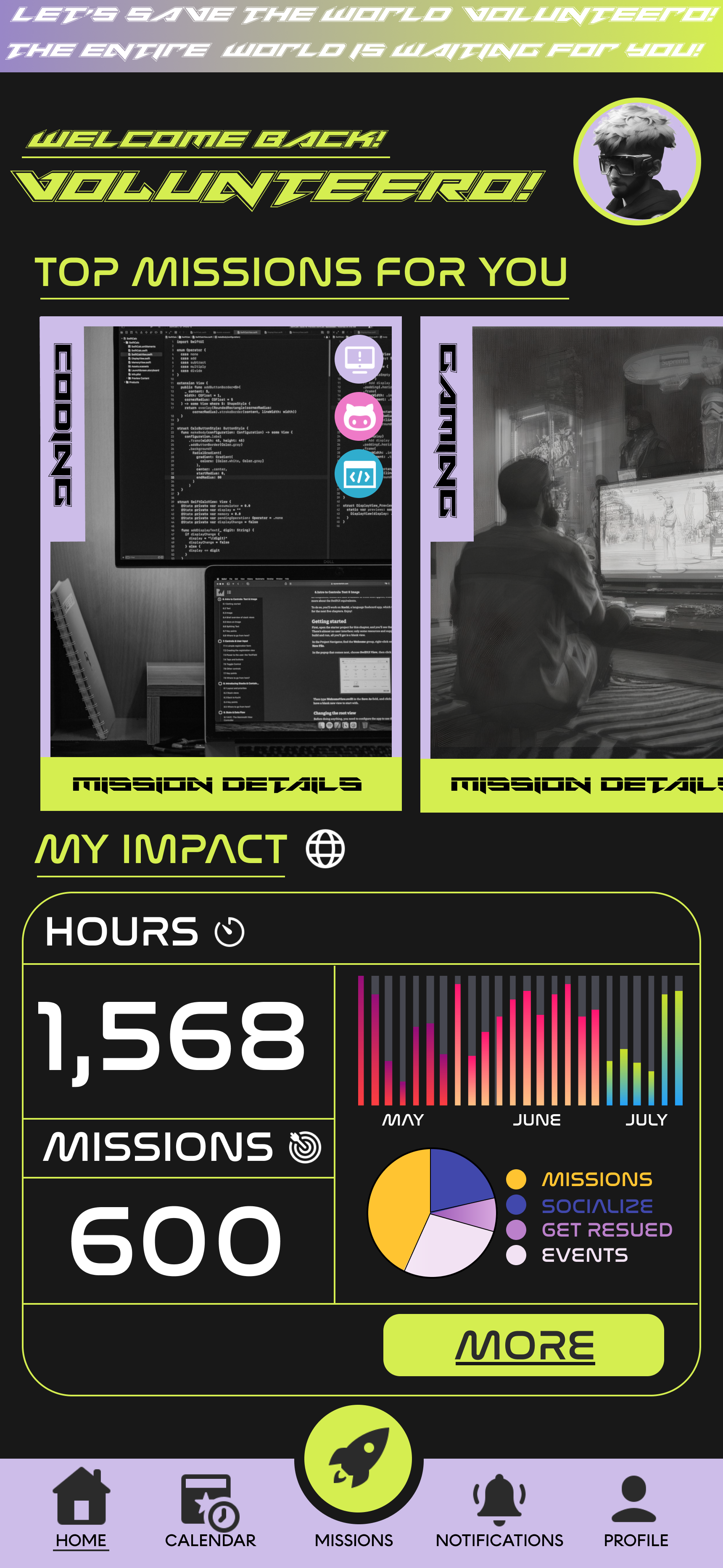
FINAL DESIGN
Throughout the testing and research process, I understood the value of conducting interviews first hand. It was very valuable for users to tell us what they want to see as opposed to us guessing.
Takeaways
It is essential to include the developer in the early stages of the design process as the feedback received from a technical perspective was extremely valuable to designing and building the app.
A simple user interface with a clear call to action not only increased the engagement of the users with the app, they also spent more time completing missions.


