CONVERSE
OVERVIEW
Converse is a B2C application meticulously crafted to combat the prevalent issue of fraudulent transactions plaguing social media platforms, particularly in the context of concert ticket sales. Recognizing the widespread problem of scams affecting thousands of individuals seeking concert tickets.
Converse also acknowledges the massive demand from concert enthusiasts for a reliable method to connect with other concert-goers attending the same concert.
I crafted and led the end-to-end mobile user experience and interaction design from user flows, rapid testing, and prototyping to producing engaging animations and branding material.
Role
UX/UI Lead
Branding, UI/Visual Design, Rapid Testing, Prototyping, User Flows, and Research.
Timeline
6 Months +
A hub for music enthusiasts to connect, experience, and converse
CONTEXT
An opportunity to REDEFINE THE CONCERT EXPERIENCE
It’s about offering a safe and immersive hub for fans to share their boundless love for music.
The absence of a dedicated and secure space for buying tickets and connecting with other fans has created an environment where concert-goers are left exposed to the risks of financial loss and missed opportunities. The absence of such a platform not only jeopardizes the financial well-being of concert-goers but also hinders the potential for creating meaningful and secure connections within the vibrant community of music lovers.
PROBLEM
Concert ticket scams have soared by more than 500% in 2022
According to The Gurdian, Concert ticket scams have soared by more than 500% in 2022, with those defrauded losing an average of £110, as criminals target fans of leading acts. Research by Lloyds Bank showed reported cases of people being scammed surged by 529% year on year between March 2022 and February 2023.
Individuals often resort to unconventional methods, such as turning to Twitter, to find like-minded companions leaving them vulnerable to potential risks.
The alarming trend of purchasing concert tickets through social media platforms, has led to a surge in scams and fraudulent transactions.
With a busy life and a job, most people find it difficult to find like-minded people.
THE CHALLENGE
To address the problems we had to start with the ‘how’
How do we authenticate users of the platform to ensure that all users feel safe and comfortable connecting with each other?
How do we authenticate sellers of concert tickets to ensure that no fraudulent transactions occur?
What is the appropriate method to connect people with each other?
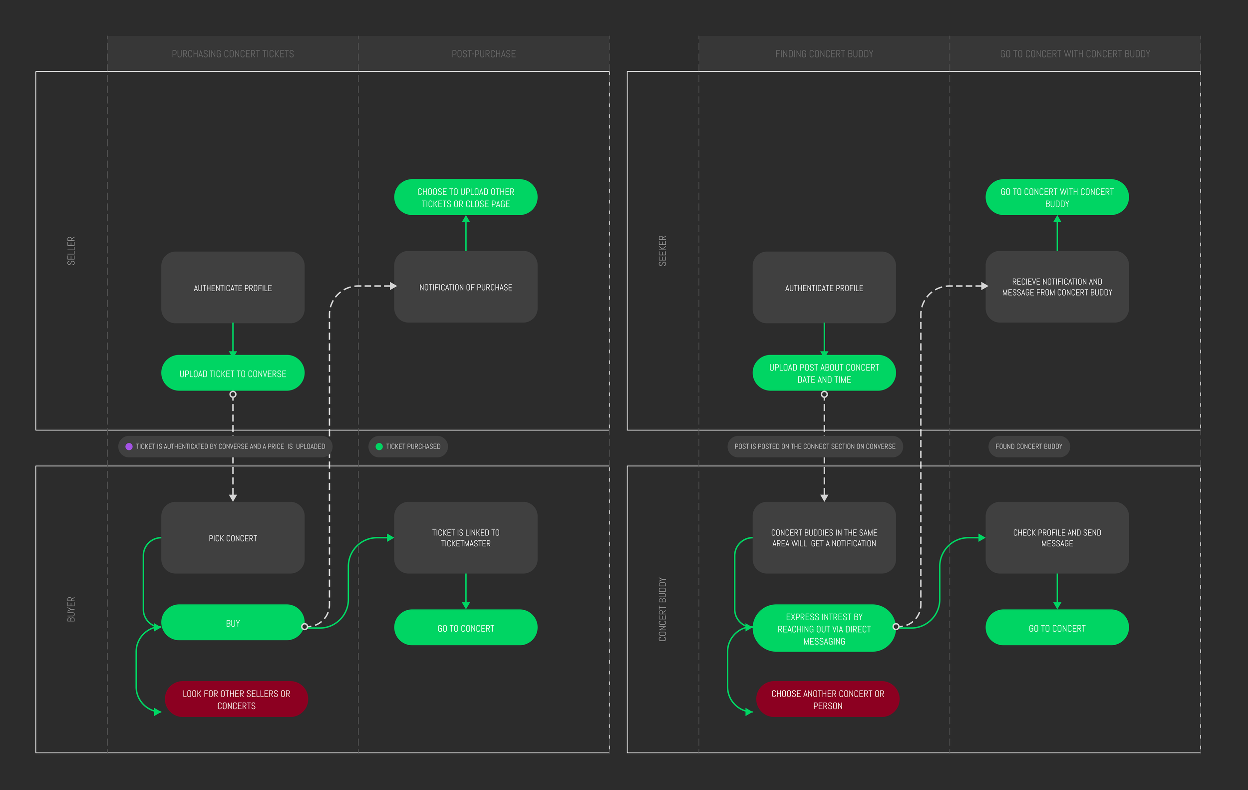
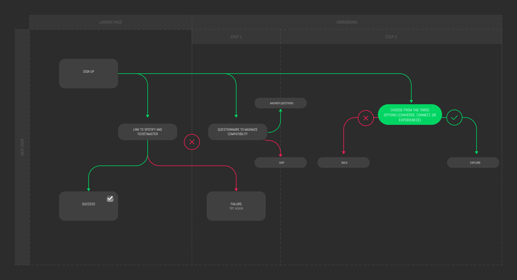
User Flows
SIGN UP (OR LINK WITH SPOTIFY)
AUTHENTICATE PROFILE
CHOOSE INTEREST
COMPETITIVE ANALYSIS
Ticketmaster/StubHub
Platforms like Ticketmaster and StubHub rely on a market-driven pricing model, often leading to inflated resale ticket prices. Users may encounter exorbitant rates due to high demand or speculative pricing strategies.
While these platforms offer a wide array of tickets, they may lack stringent authentication measures for sellers, leading to potential risks for buyers dealing with unverified sellers.
While these platforms focus primarily on ticket transactions, the community aspect may be limited, and users may miss opportunities to connect with like-minded concert-goers.
CONVERSE
Converse revolutionizes pricing transparency by analyzing official artist data when tickets first go on sale. The app calculates an average ticket price, ensuring that resale prices align with fair market values. This innovative approach eliminates the issue of ridiculously high resale tickets, providing users with a transparent and equitable ticket marketplace.
Converse prioritizes user safety by implementing mandatory authentication for all users before they can resell their tickets. This not only builds trust within the community but also significantly reduces the risk of fraudulent transactions.
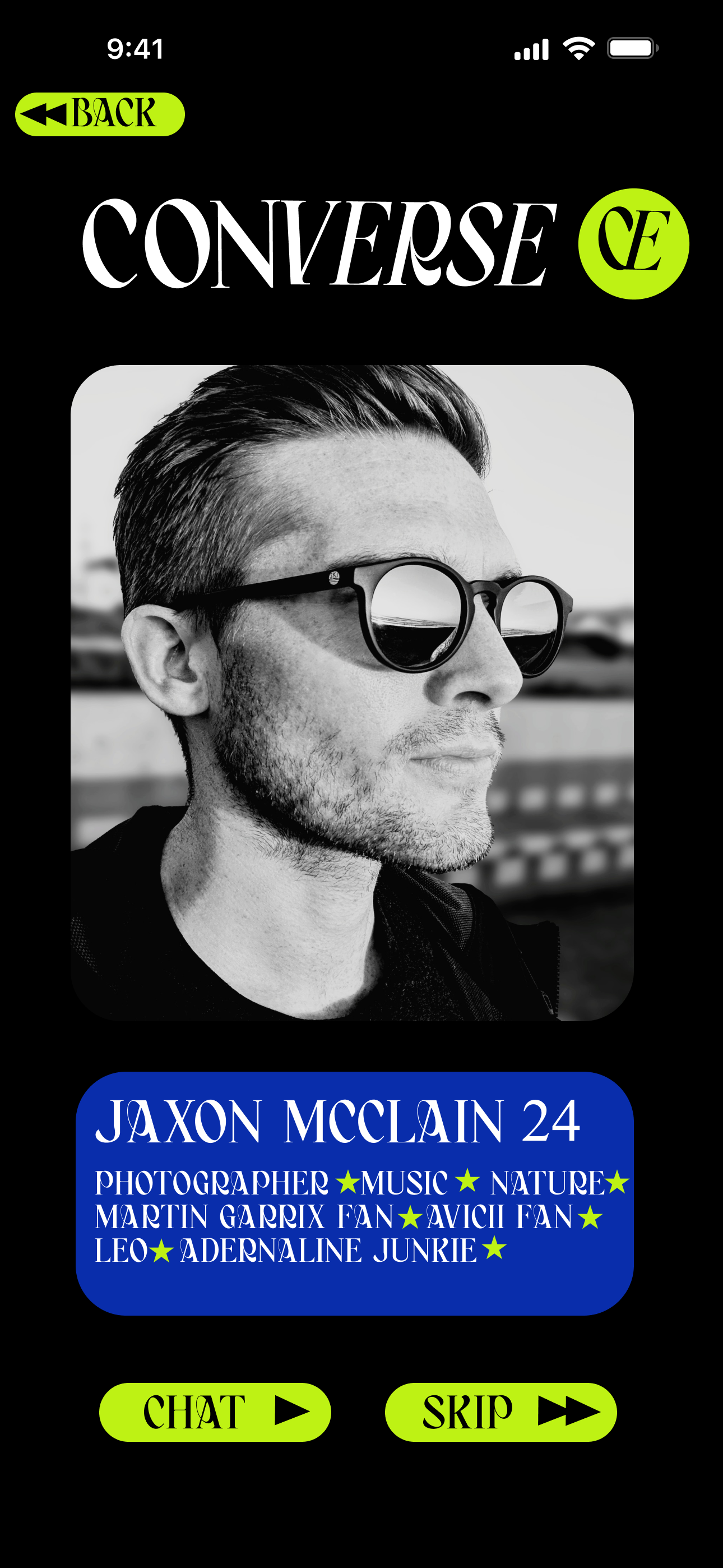
Converse goes beyond being a ticket marketplace; it's a thriving community where users with similar music tastes can connect, chat, and even plan concert experiences together.
DESIGNING THE INTERFACE
STUDYING THE USER BEHAVIOR“How do i know which ones are legit?”
After conducting various A/B testing and interviews with users, it was evident that users were looking for filters for the cheapest tickets and verified sellers.
It was difficult for the users to navigate the page due to the lack of filters, no clear call to action, and lack of details on the tickets/sellers.
The modified interface included filters, a verification icon next to verified profiles, clear call to actions, and more details on the tickets. This change in interface simplified the navigation process and increased the user engagement by almost 60%.
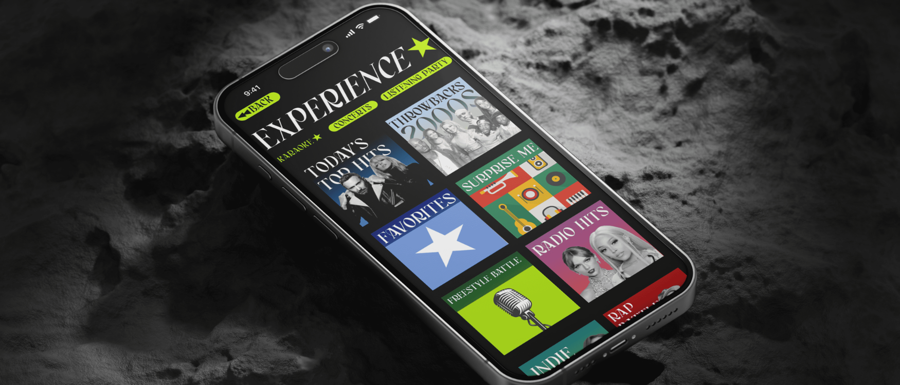
FINAL DESIGN
Listening to the users and their pain points through conducting interviews first-hand was extremely beneficial as it shaped the entire design.
Takeaways
Rapid testing early in the design process was important as it made it easy for us to assess users’ behaviours when presented with different options of the interfaces created. This helped us understand the user’s needs prior to investing hours and days producing high-quality prototypes.
Using Notion and Jira to manage the tasks/deadlines set helped us move the project forward.


